RiverBrooke Farm Cookbook

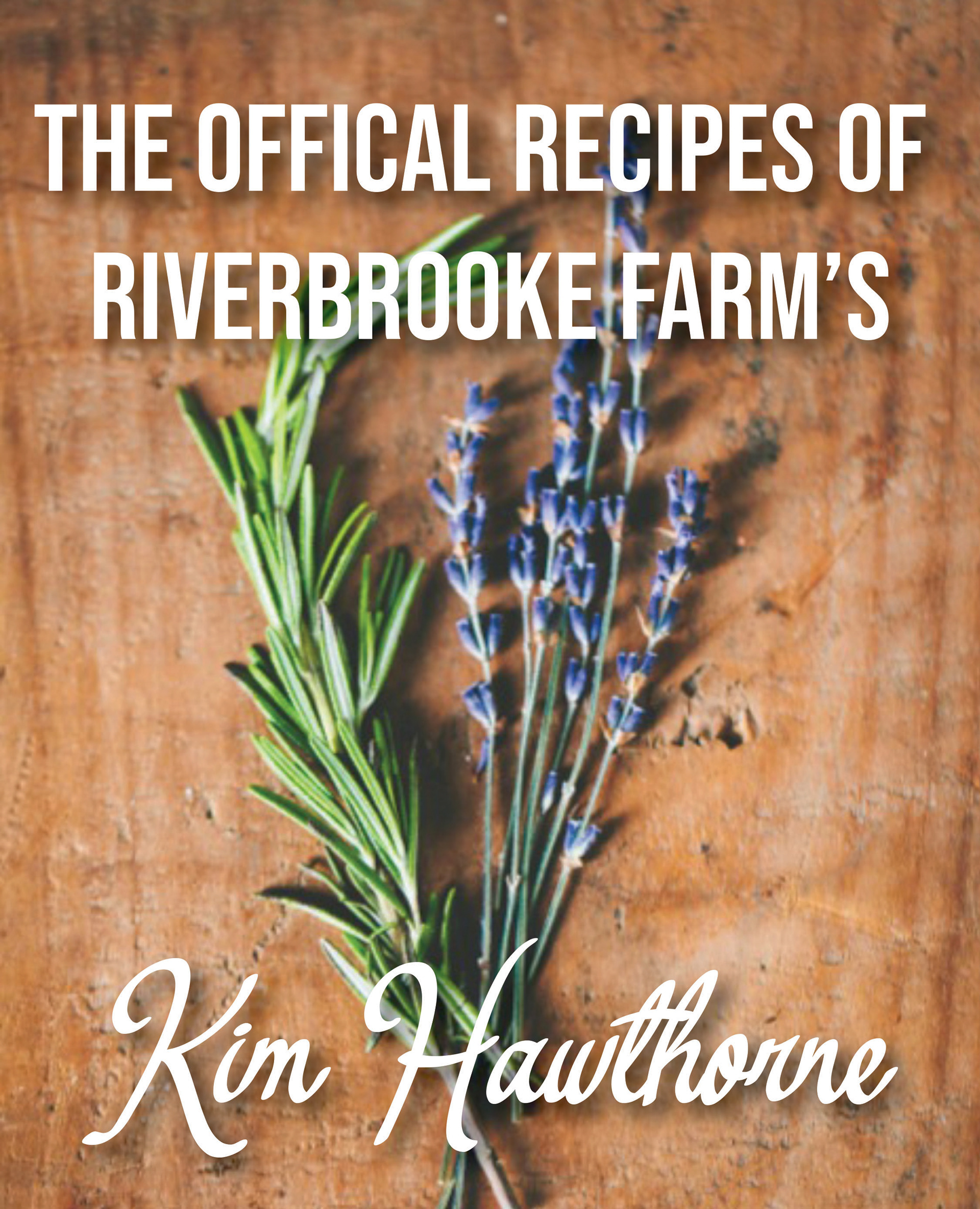
RiverBrooke Farm is an organic and family owned farm in Northern California. While they grow many different types of crops, the ones they are best known for are their lavender and spices. Kimberly Hawthorne is responsible for the majourity of the farm's recipes, which means that she uses ingredients that can almost all be found on the farm. Her sustainable and do-able approach to gourmet cooking from lavender ice cream to hand pressed sangria to stuffed pork loin. I was hired by RiverBrooke Farm to help showcase the recipes of Ms. Hawthorne in the form of a new cookbook. The use of the scratched and well-loved wood behind the lavender and rosemary stalks connote the hard working attitude used by farmers, while the delicate few stalks connote a sense of luxury and refinement. The juxtaposition of the two elements are mirrored by the fonts used, the top one being a no-nonsense sans serif font and the bottom being a neat but whimsical font. The burnt orange spine and inner cover help add depth and once again luxury to this design, breaking up the wood and adding a touch of modernity to the cookbook.
Top CBD
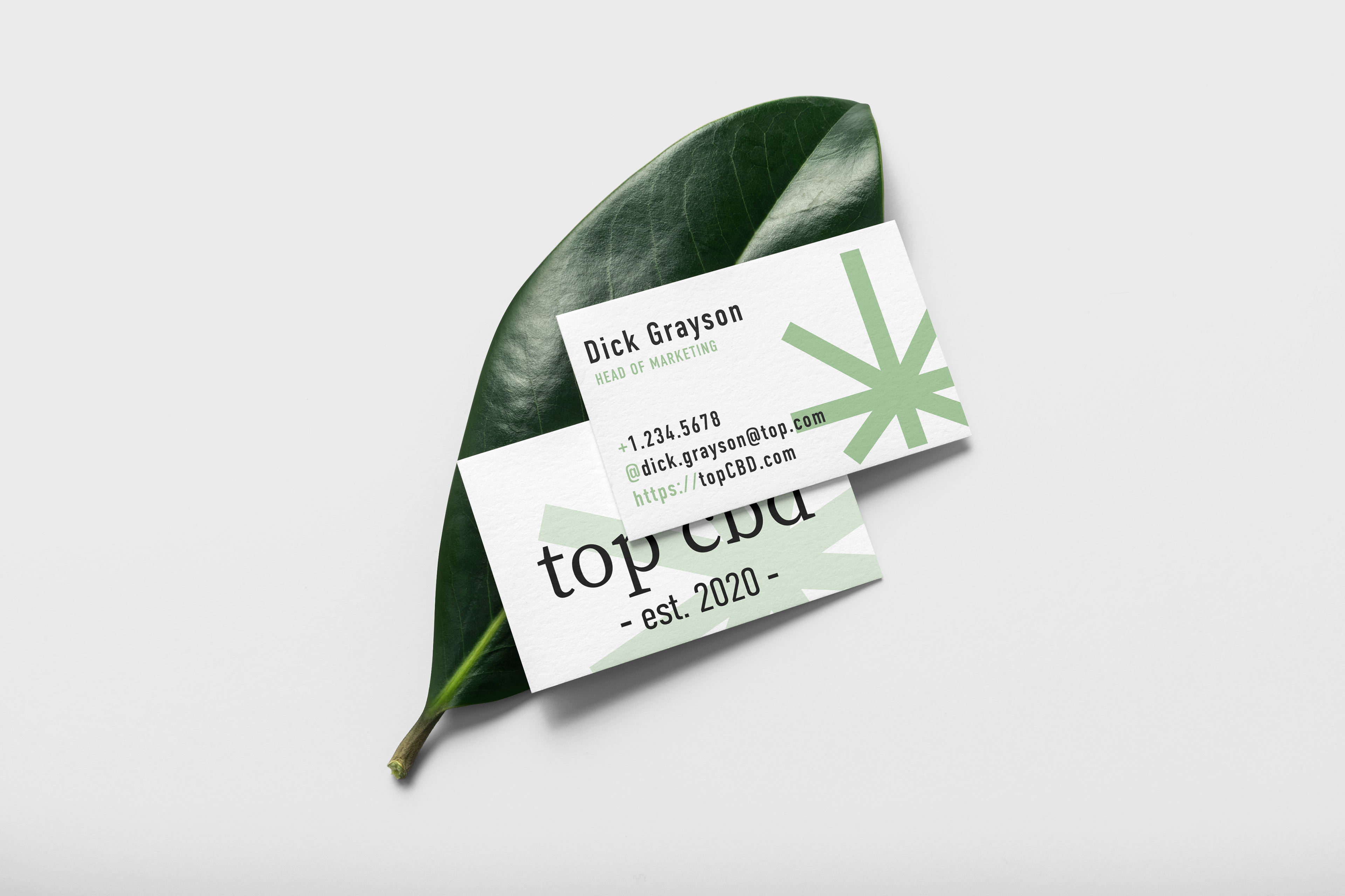
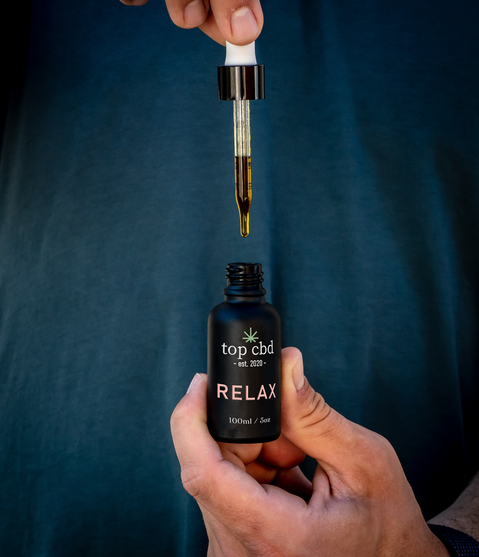
Top CBD is a Portland-based cannabis brand. They want to bring their consumers a high quality, compliant product to bring a calming touch into the lives of those who need it. This is the product is for driven women who want the effects of some after-work wine without the wait gain that comes with it. They needed a complete branding overhaul, including logo, colour pallet, marketing collateral, and compliant labeling & packaging. The minimalist style of the logo combined with the relaxed colour pallet is a subtle way to display the product without being too loud.
RiverBrooke Brewing Co.
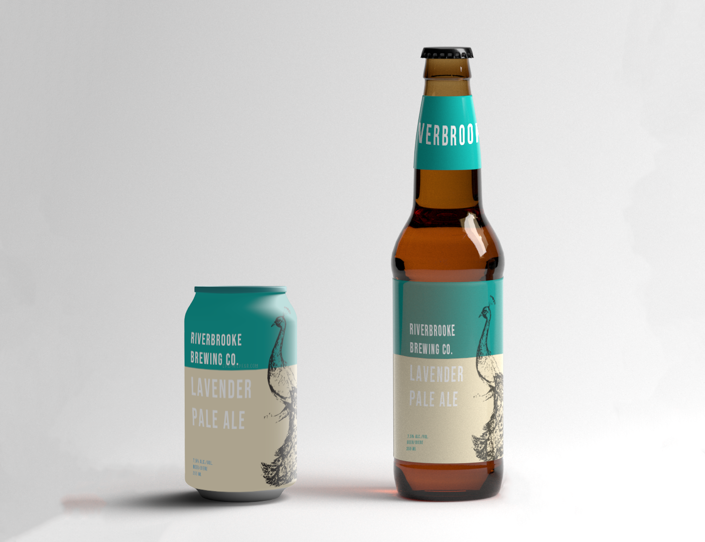

The RiverBrooke Brewing Co. is owned by RiverBrooke Farms, which advocates for organically grown family farming. Like their parent company, the RiverBrooke Brewing Co. grows all of their own hops and processes them onsite using members of the Hawthorne family. One of the company's favourite things about their fields is that it is roamed by a wild peacock. As the mother company primarily specializes in lavender growth, the RiverBrooke Brewing Co. asked that lavender be reflected in the names of their different beers. I was hired to labels that reflected the family-grown nature of the hops as well as the company's carefully cultivate sophistication. The font is a typical Sans Serif, which connotes a no-nonsense attitude, while also the separation of colours by the bold and elegant teal adds a feeling of fun. The peacock, especially in its hand-drawn aesthetic, connotes an elegance that has existed for a long period of time.
Trout Stalker Ranch

The Trout Stalker Ranch is a ranch based in Chama, New Mexico that wants to combine education, conservation, holistic management, and wilderness. What began as the rescuing of a single acre from development in 2011 has blossomed into a 1540 acre Land Conservatory. I was hired to design 7 of my signature "Badge" designs; 3 for the Ranch and 4 for their wild horse sanctuary. These designs were turned into hundreds of stickers that were given to supporters, visitors, and ranch-members.
H.I.I.T. Box

HIIT Box is a fitness company based in Colorado that delivers fitness equipment directly to your door once a month so you can keep up with their latest online gym streaming service. They have extravagant grand prizes that you can win if you get lucky. They hired me to design their subscription box that was fun, exciting, and focused. Using the company's colours not only makes the box a statement piece, but also reinforces to the consumer that this particular shade of blue relates to HIIT Box. The minimalist style of the both connotes a focused and no-nonsense attitude, while the splashes of light blue elevate the tone to make it more fun. The print on the inside cover capitalizes on the idea that every aspect of this box is carefully consider, and by extension so are the consumers. The print on the inside also encourages exploration of the rest of the box to look for more "hidden" messages, which gives HIIT Box a higher chance of utilizing the advertising space of the rest of the box. The print on the inside bottom of box not only promotes user engagement, but promotes consumer advertising. The overall look of the box is sleek but fun, making the box an exciting treat to receive in the mail, which is the ultimate goal of any subscription box.
Play On
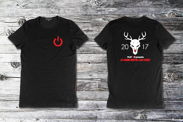
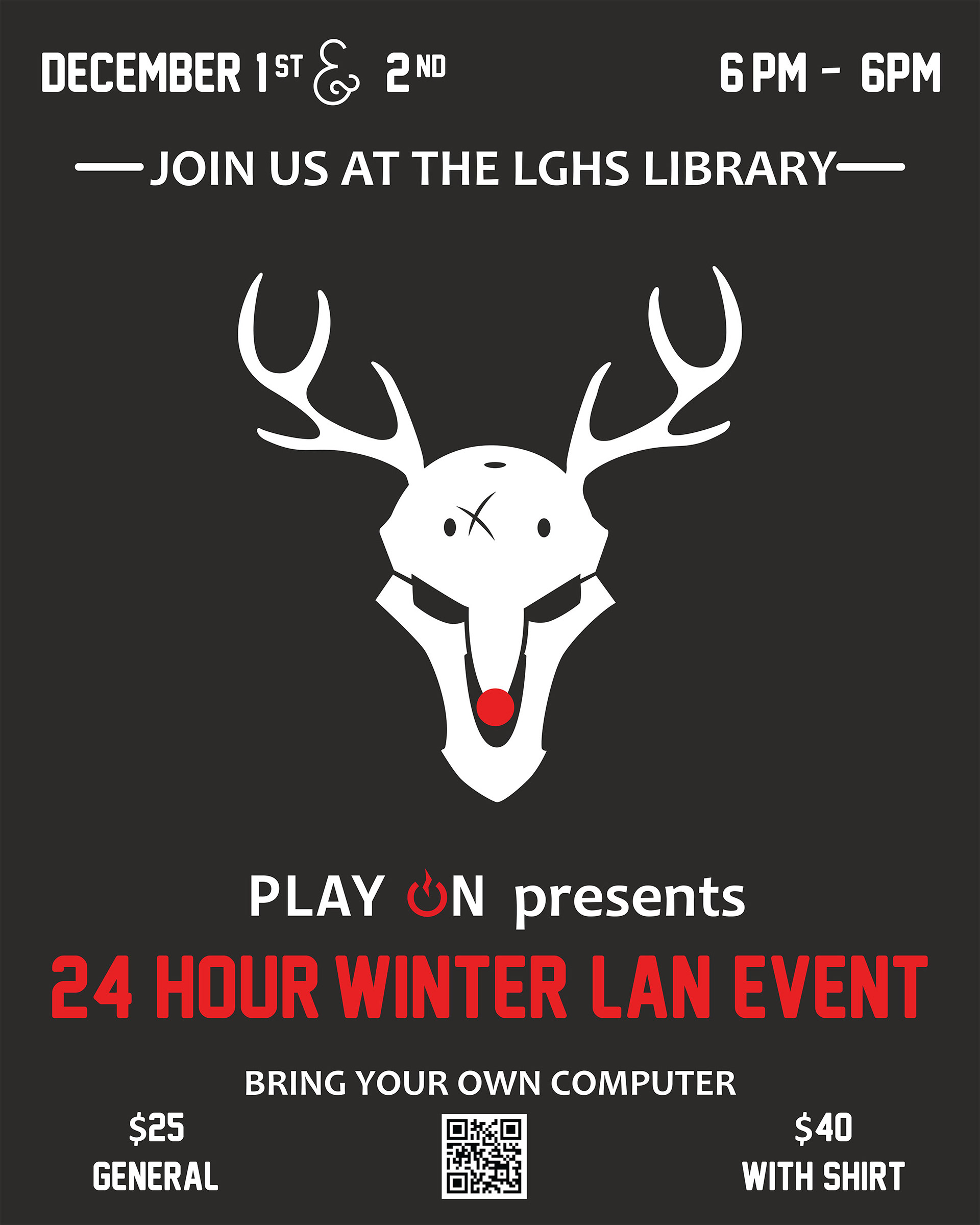
Play On is a nonprofit that hosts 24 hour gaming tournaments for charity. This year's event was supposed to take place in December, so they needed a wintery themed event poster and shirt design to go with their event. I took a character from one of their most played video games and turned it into a Rudolph design. The whole thing is in a minimalist style to connote efficiency and give it a “next generation” feeling. Play On’s 24 hour gaming event needed commemorative shirts to help further raise money for charity. On the front I put their company logo, and on the back I carried over majour aspects of the poster to maintain consistency among the designs.
You can see more of their work here
KAIRA Sushi Branding
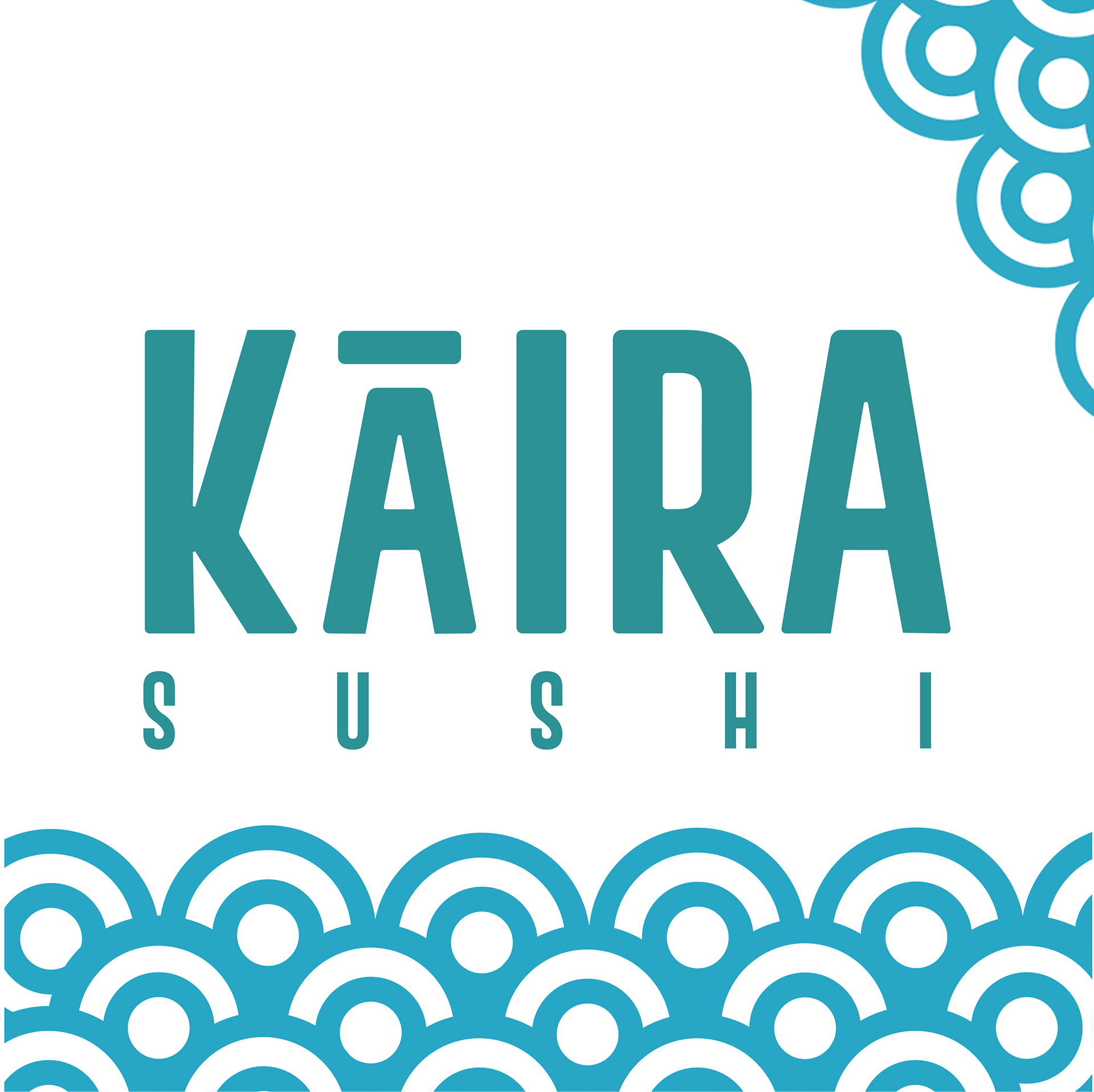
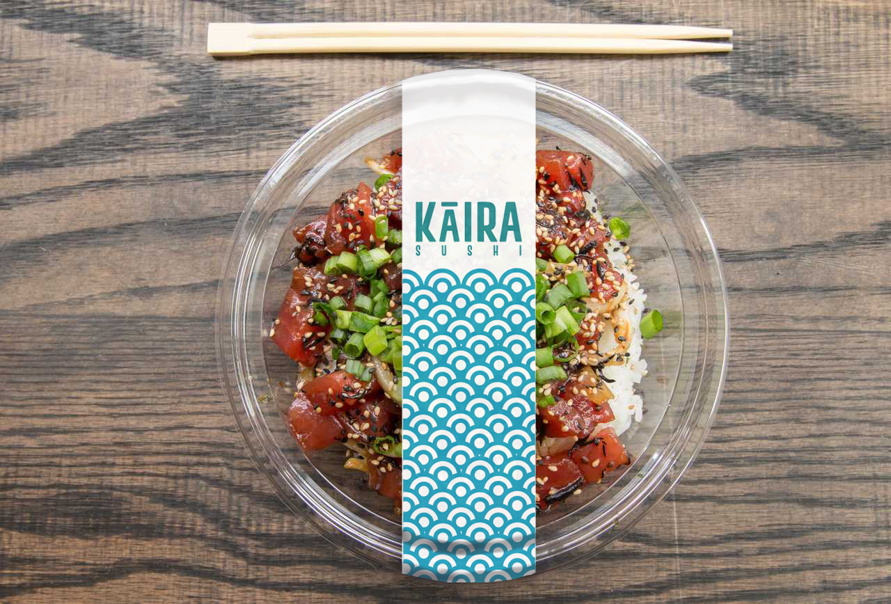
KAIRA Sushi is a take-out sushi store that differentiates itself by making sushi affordable and catering to the Instagram-fueled demographic through aesthetic and accessibility. They needed me to design some stand-out sushi packaging that would allow for an undamaged delivery, a menu, website, logo, and business cards. The blue scales are both an allusion to the scales of a fish and ocean waves to help the customer make the association to the fresh product they produce. This colour scheme also further helps to differentiate the brand from its typical black and red competitors.
Ragazzi Boys Chorus
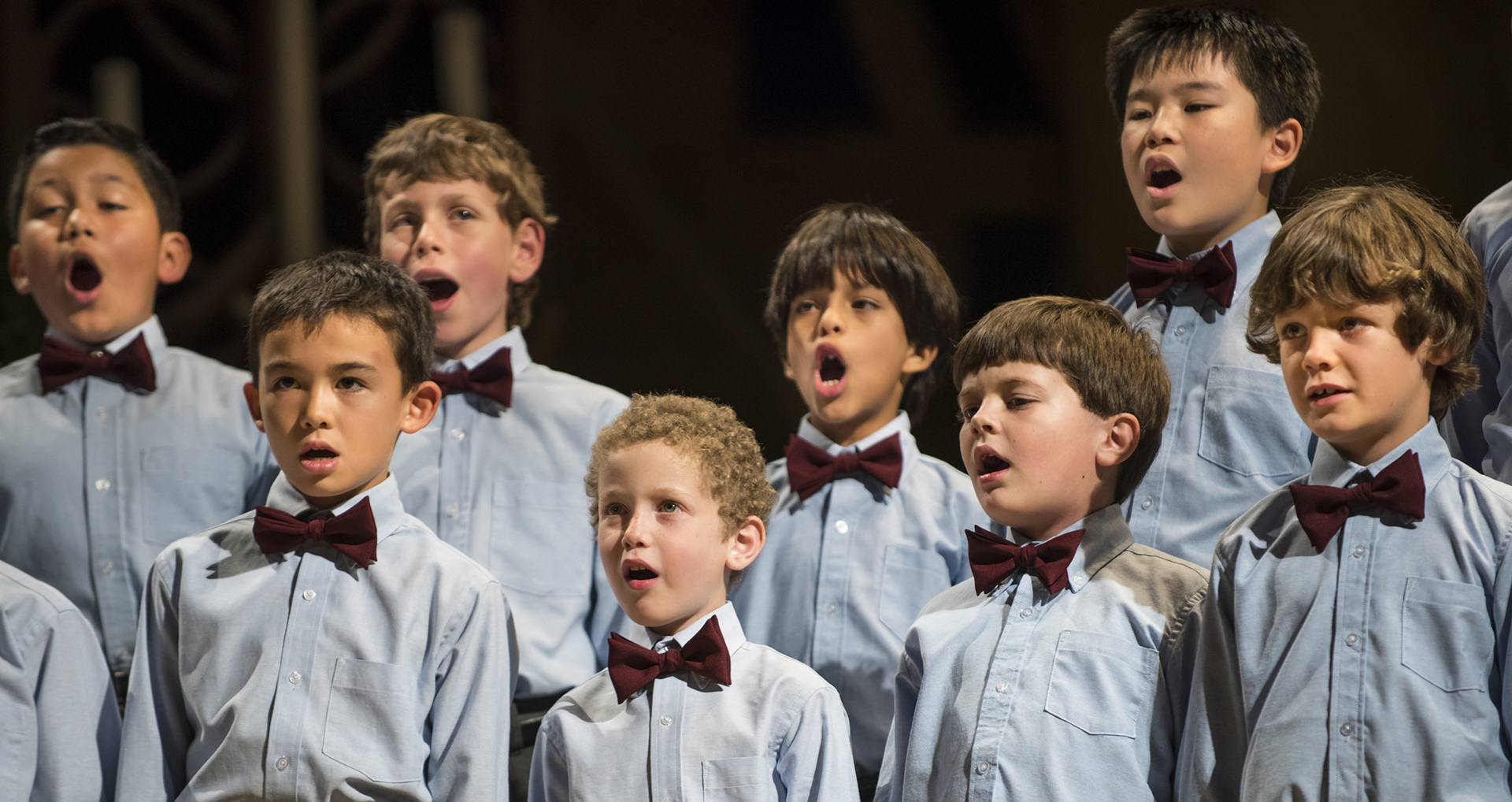

The Ragazzi Boys Chorus tours internationally every other year, and this year they will be touring Canada. They hired me to design a logo based on their existing logo that would capture their tour destination in a sleek and professional manner. Hence, the Maple Leaf is the unequivocal symbol of Canada. This final design is for tour shirts, event posters, luggage tags, and flyers.
You can listen to them here
Haiku Holiday Film Faire
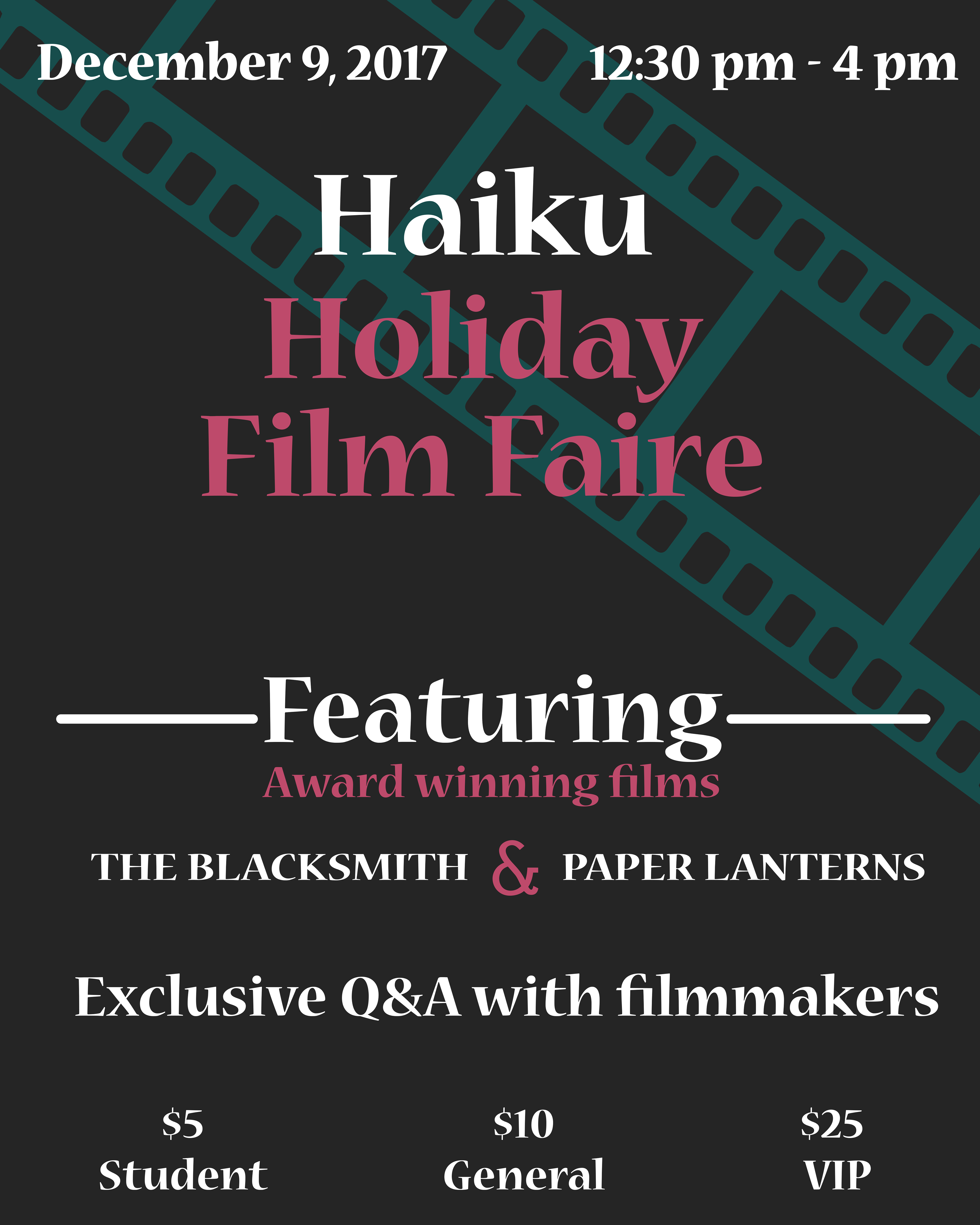
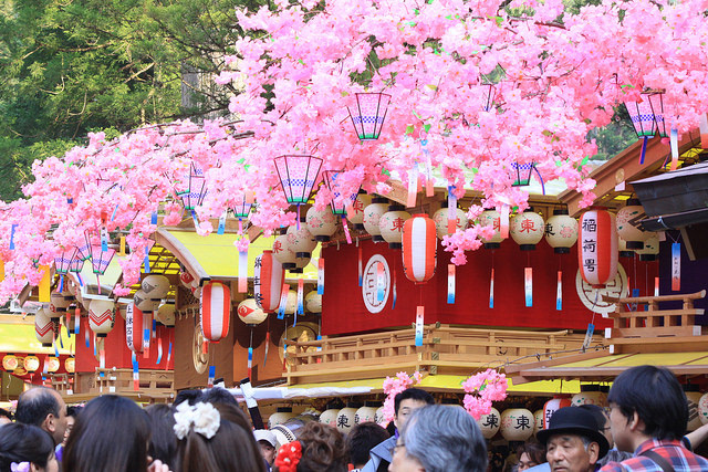
The Haiku Holiday Film Faire is an annual film festival that celebrates Japanese culture in the heart of Silicon Valley around Christmas. They hired me to create a flyer/poster to advertise their event. This poster follows a minimalist style of design, with a font that is often seen with aged texts. Greens and reds are very central to Japanese traditions, red representing strong emotion and action and green representing youth and vitality, and wrapping it together with vintage film encapsulates the feeling that the film festival hopes to give people.
Nuudii Retail & Mailer Packaging
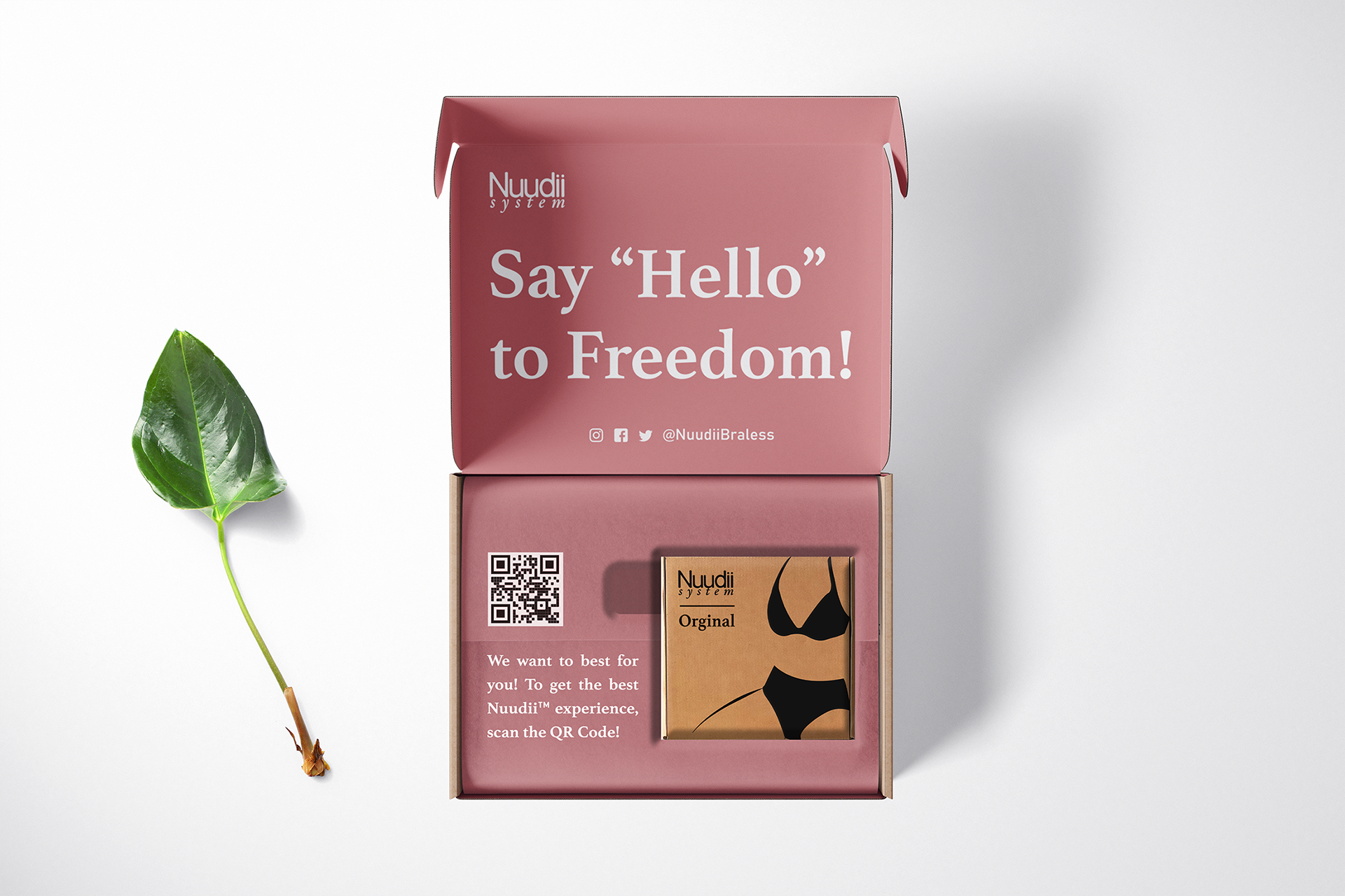
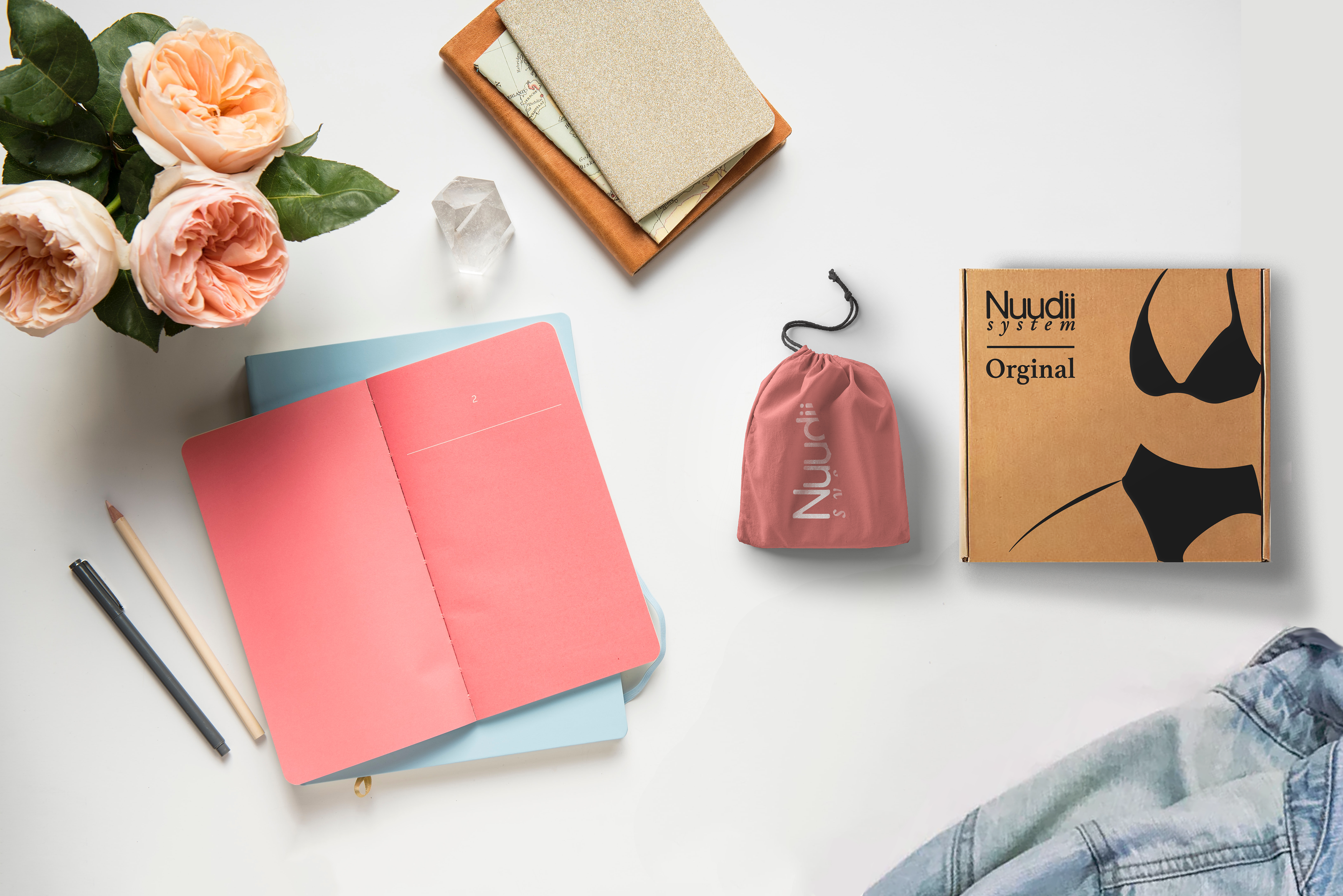
Nuudii System is the world's first "Braless Bra" designed by women for women! They take the best from the world of fashion and sustainable to create a product that exclusively brings comfort and joy into the lives of its consumers. They needed packaging that reflected the quality of their product while still remaining eco friendly. The best way to accomplish this was to use their strong colour pallet to make the white serif text stand out and better connect with their consumer base. The canvas carrying bag(weighing only 1oz!) carries the brand consistency needed for easily transport needed professional women.
Antur Supply Co.
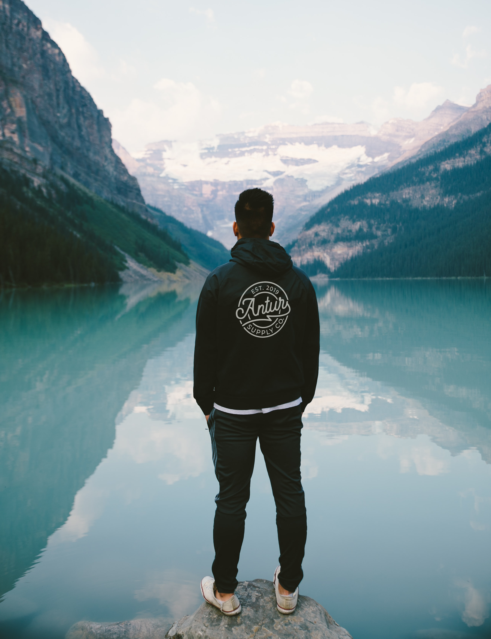
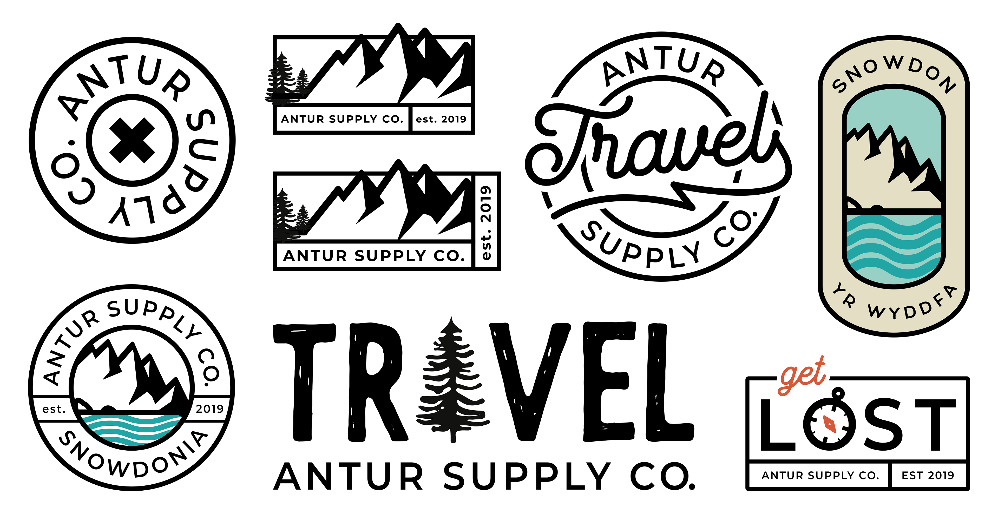
Antur Supply Co represents the best of North Welsh travel gear. "Antur" is the Welsh word for "adventure" which needed to be reflected in their graphic apparel. Appealing to their target demographic, young professionals ready to explore the world, minimalist design with a few strong colours or script elements made for eye-catching and memorable designs. This apparel had to be for everyday wear while still remaining essentially an advert for the Antur Supply Co.
So Damn Good Coffee

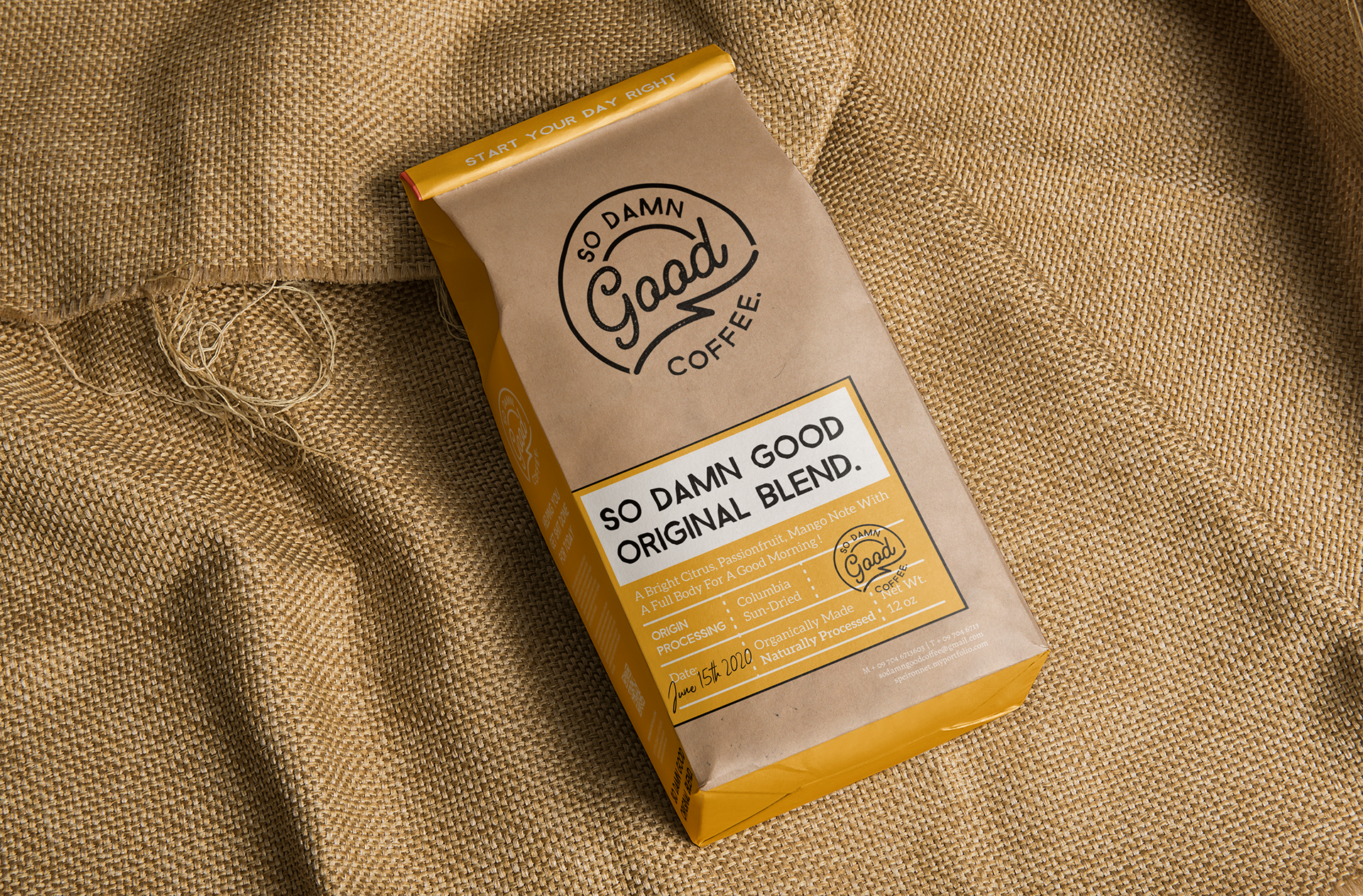
So Damn Good Coffee is a company that gives you a helpful morning boost in a more adult way. These single-sourced beans are a sun-dried to help give you that kick in the teeth you need to get going in the morning. The brand appeals to its target demographic of entrepreneurial, young professionals who work long hours and need some humour in their day. The strength of the coffee paired with the cheekiness of the messaging helps consumers create an emotional bond with the product that encourages them to integrate it into their daily routine. The brightness of the colour pallet adds another element of fun to the product.
Los Gatos High School Magnets
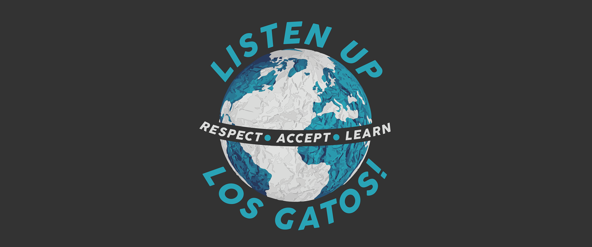
Los Gatos High School cultivates a community of understanding and cultural awareness among its students in the hopes of the next generations leading the world into a better tomorrow. Jacob Young and I were hired to redesign to create something that both looked professional and captured the spirit of the school. Blue tones are the central colour of the design, as blue is often associated with trust, stability, and intelligence. The dots separating the white owrds brings unity throughout the designand encourages the eye to explore it further. It makes a fun and thoughtful refrigerator magnet for students and faculty.
See more of Los Gatos High School here
Like what you see? Message me below if you need some work done and I'll get back to you as soon as possible!
Thank you! I'll get back to you as soon as I get the chance!