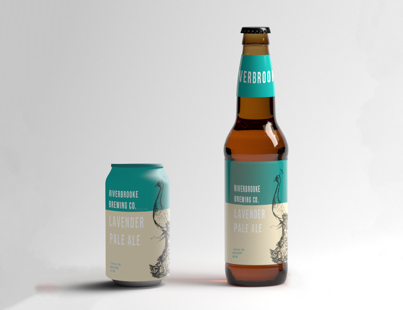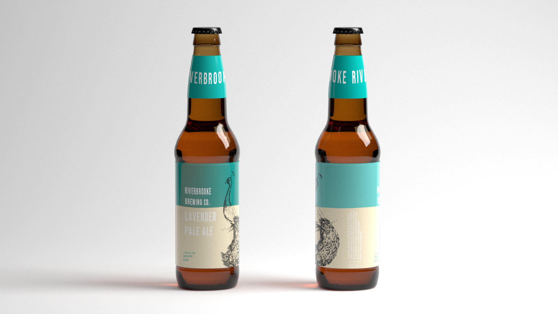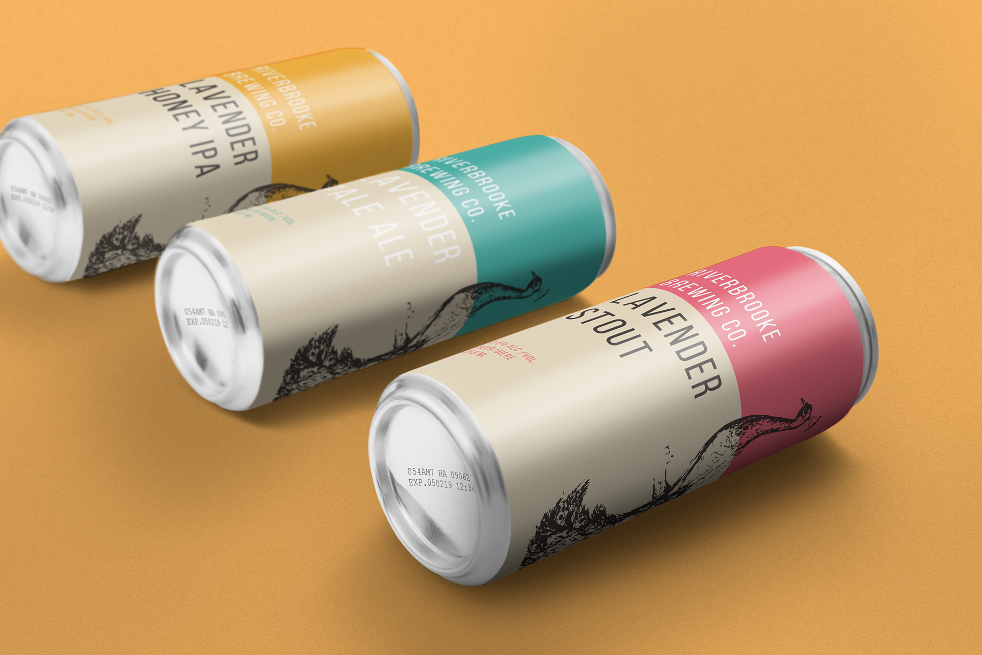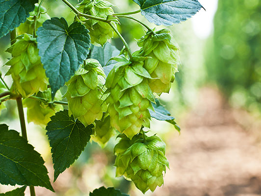

The RiverBrooke Brewing Co. is owned by RiverBrooke Farms, which advocates for organically grown family farming. Like their parent company, the RIverBrooke Brewing Co. grows all of their own hops and processes them onsite using members of the Hawthorne family. One of the company's favourite things about their fields is that it is roamed by a wild peacock. As the mother company primarily specializes in lavender growth, the RiverBrooke Brewing Co. asked that lavender be reflected in the names of their different beers. I was hired to create a logo (and later labels) that reflected the family-grown nature of the hops as well as the company's carefully cultivate sophistication. The main font, which can often be seen used on a piece of sheet metal or on a piece of equipment, helps to add the hard working feeling to this logo, while the compressed nature of the secondary font conveys an feeling of underlying and unspoken class. The peacock is of course a alliteration to the wild peacock that roams the hops fields. The peacock, especially in its hand-drawn aesthetic, connotes an elegance that has existed for a long period of time.