RiverBrooke Brewing Co.
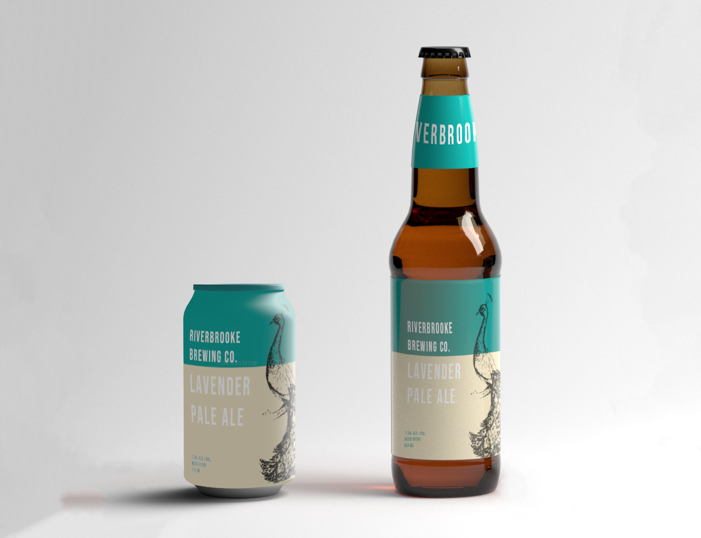
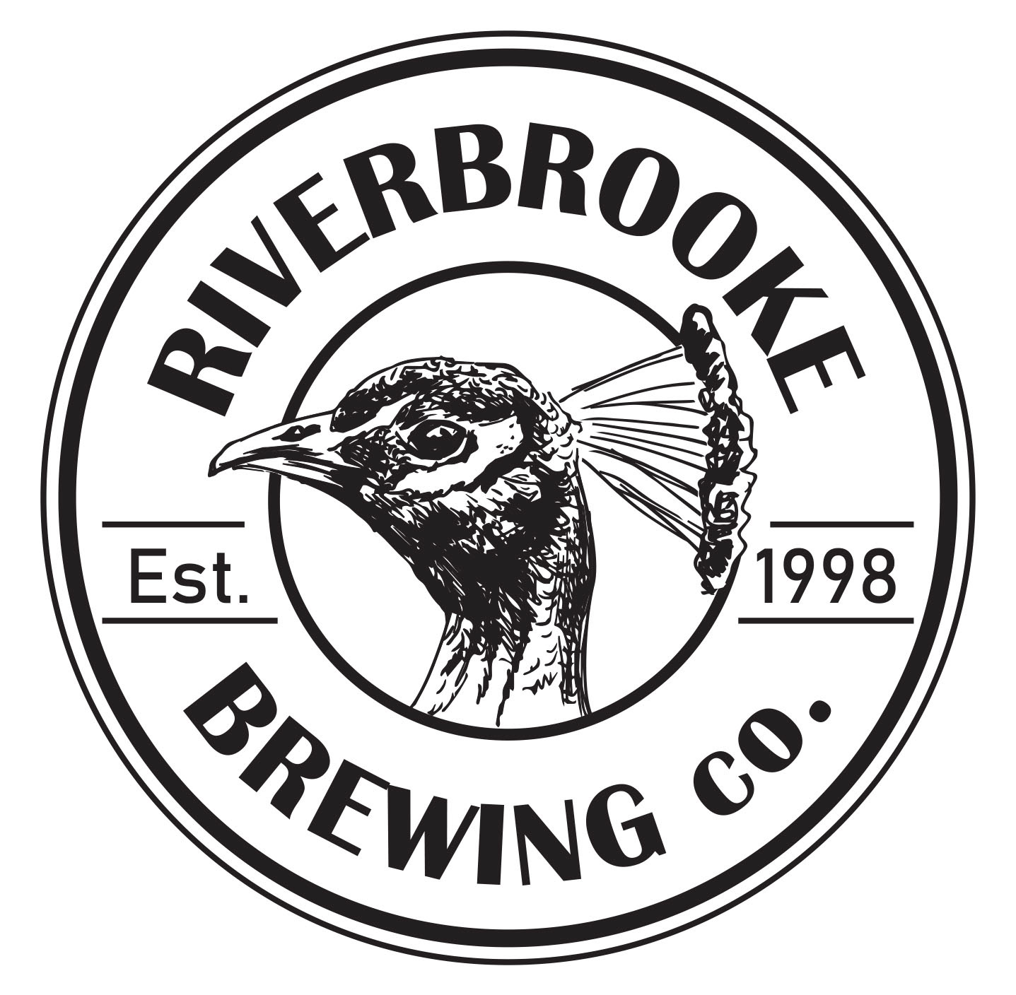
The RiverBrooke Brewing Co. is owned by RiverBrooke Farms, which advocates for organically grown family farming. Like their parent company, the RiverBrooke Brewing Co. grows all of their own hops and processes them onsite using members of the Hawthorne family. One of the company's favourite things about their fields is that it is roamed by a wild peacock. As the mother company primarily specializes in lavender growth, the RiverBrooke Brewing Co. asked that lavender be reflected in the names of their different beers. I was hired to create a logo (and later labels) that reflected the family-grown nature of the hops as well as the company's carefully cultivate sophistication. The main font, which can often be seen used on a piece of sheet metal or on a piece of equipment, helps to add the hard working feeling to this logo, while the compressed nature of the secondary font conveys an feeling of underlying and unspoken class. The peacock is of course a alliteration to the wild peacock that roams the hops fields. The peacock, especially in its hand-drawn aesthetic, connotes an elegance that has existed for a long period of time.
Orson&Co
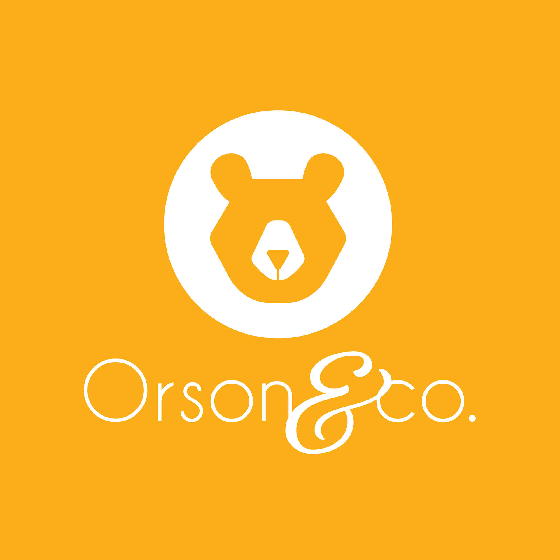

Orson&Co is a small company that does accounting and book keeping for non-profits in and around the Bay Area, especially non-profits having to do with food donations. I was hired to do a complete branding kit that was both corporate and easily approachable. As their previous logo revolved mainly around the California bear, I created a hexagonal bear that was golden in order to represent the Golden State. The hexagonal shape conveys structure and stability and the minimalist style of the bear gives the logo a professional feel. The final design was used for business cards, company shirts, buttons, notebooks, and website headers
Michael Lanza
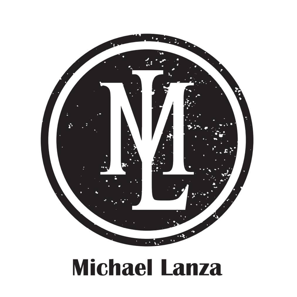
Michael Lanza is a young musician from Berkeley, California who is taking the world by storm through his Electronic and Indie Rock style of music. I was hired to develop Mr. Lanza's brand in order to help people recognize him and his music. The circle within a circle mimics the older alternative rock style of design, while the overlay of the M and the L show an air of simplicity. The combination of these aspects illustrates the complexity of his music and his character. The final design is used on promotional posters, album covers, and merchandise.
You can listen to him here
Agri-Flow


Agri-Flow is a financing company that primarily caters to farmers in the Emerald Triangle. It helps cannabis farmers to learn how to invest, bank, and generally understand how to legally watch over their money. I was hired to design their logo, branding kit, and website. The minimalist style of the design helps to establish the company as modern, sleek, and professional. Using the "A" as a stand-alone logo allows for greater brand recognition and helps to engage the viewer when it is seen in the complete company name. The swoosh of the A not only helps to differentiate it, but is an allusion to a check mark, which strengthens the idea of checked boxes on financial statements.
KAIRA Sushi
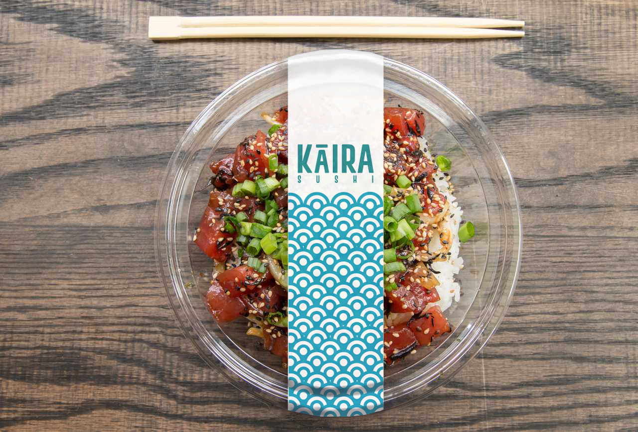

KAIRA Sushi is a take-out sushi store that differentiates itself by making sushi affordable and catering to the Instagram-fueled demographic through aesthetic and accessibility. They needed me to design some stand-out sushi packaging that would allow for an undamaged delivery, a menu, website, logo, and business cards. The blue scales are both an allusion to the scales of a fish and ocean waves to help the customer make the association to the fresh product they produce. This colour scheme also further helps to differentiate the brand from its typical black and red competitors.
You can see the full branding kit here
ACUI RegionVIII 70th Conference
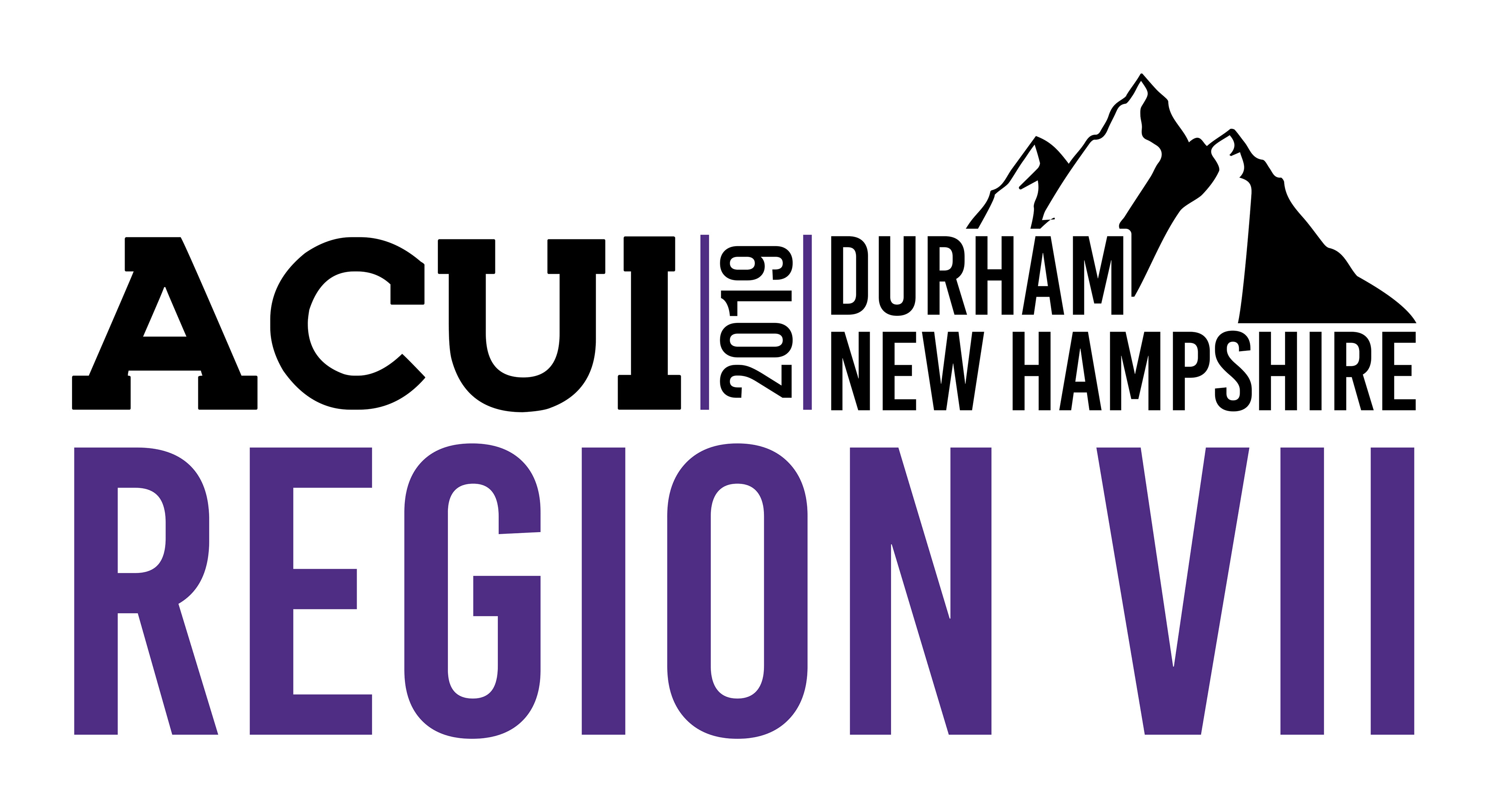

ACUI is the College union and RegionVII(northeastern region of US) needed a logo for their 70th annual conference. With the location changing every year, they needed it to reflect the area of the conference, which this year was University of New Hampshire. Because of this I chose to use the mountain motif due to New Hampshire's well-known White Mountains. This design was used for banners, shirts, posters, and all manners of Conference Swag including pens, notebooks, and sunglasses.
West Cliff Wool
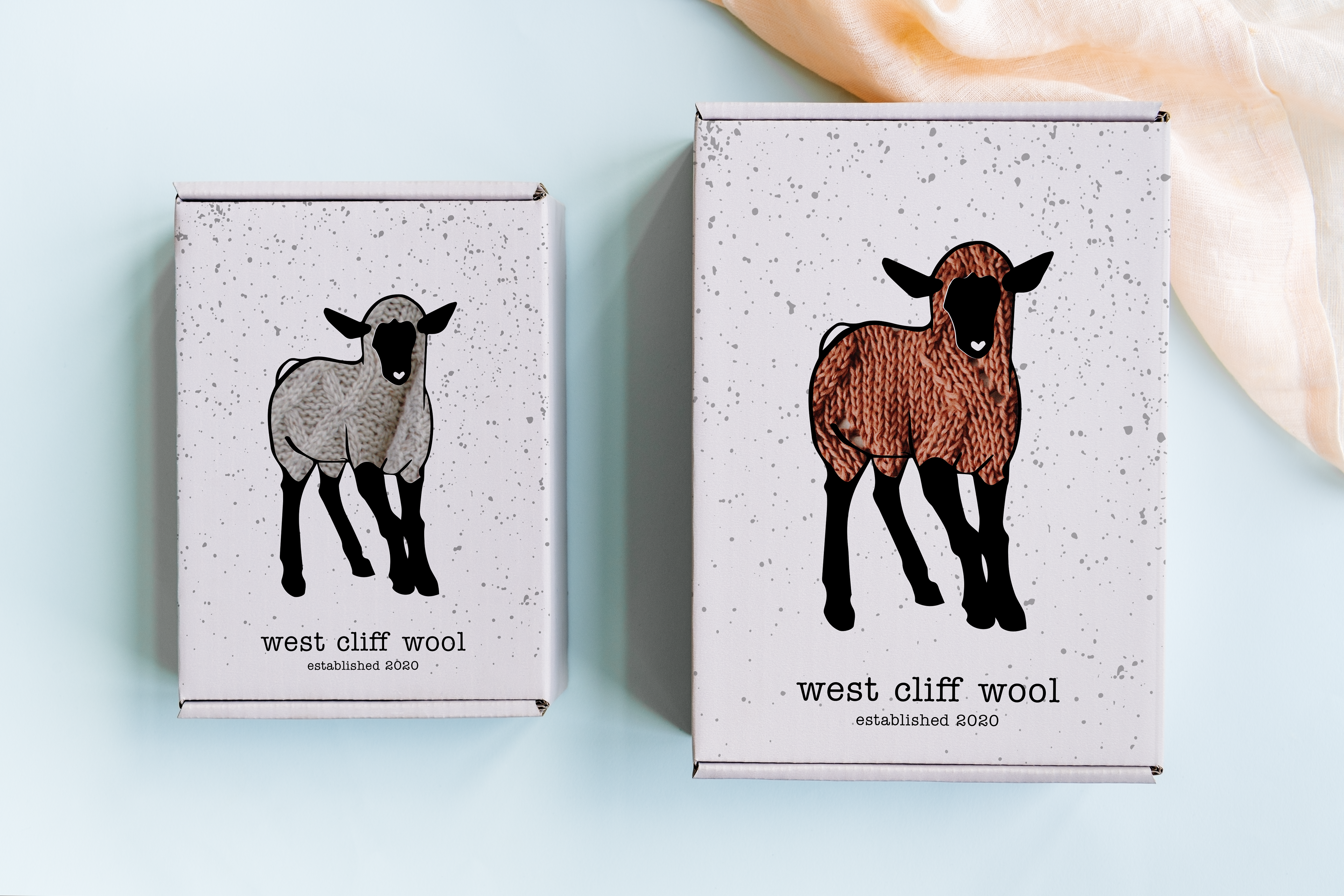
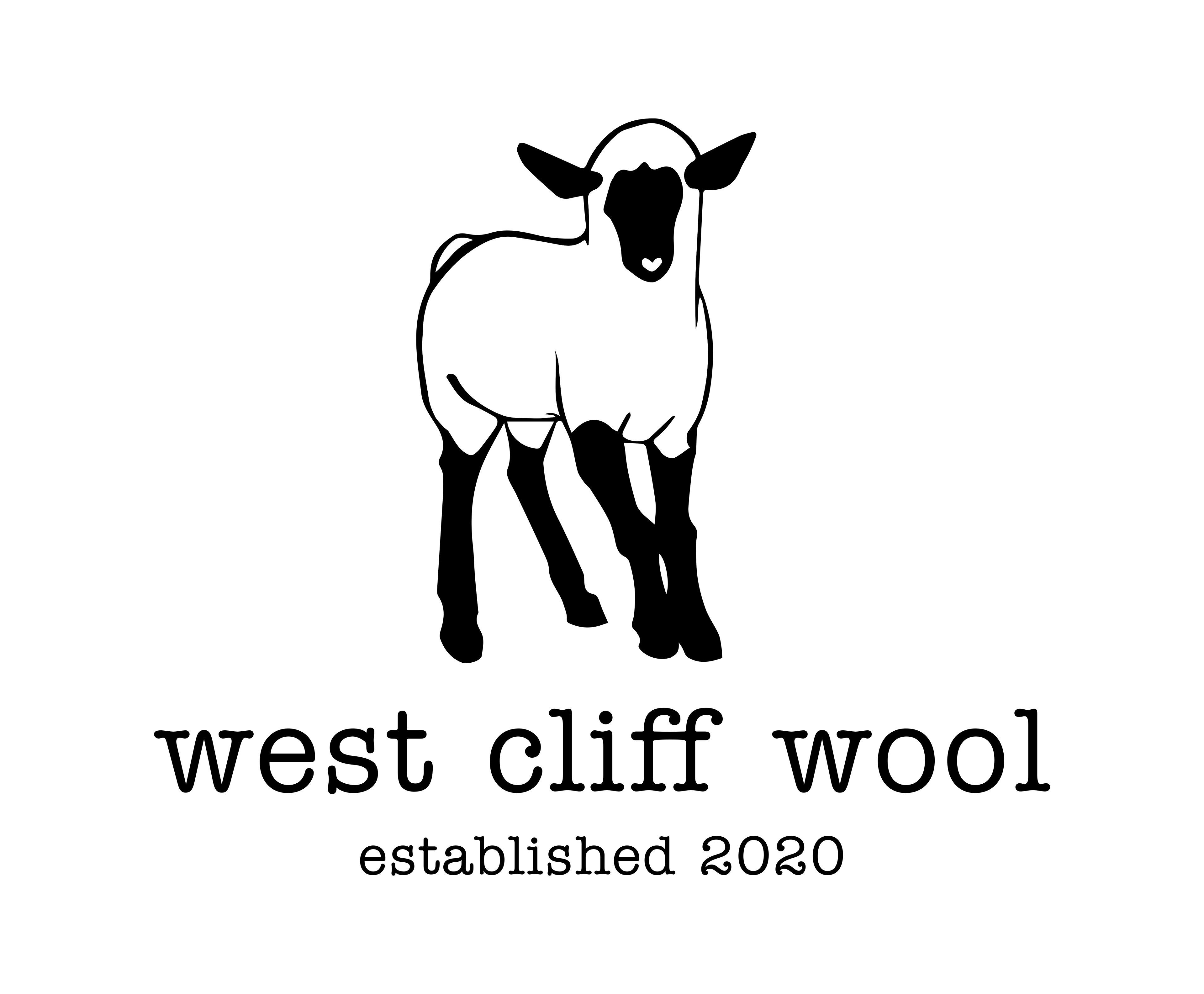
West Cliff Wool is based out of Northern California and they cater to the young generation of explorers by offering quality wool outer-wear and needed their new aesthetic to reflect that. Their minimalist logo allows for their branding to be adapted to any occasion. Their retail packaging stands out by including a clear window where the sheep's wool appears to be filled by the wool sweater/scarf beneath it.
The Bike Church
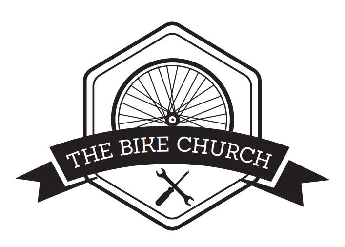
The Bike Church is one of the most iconic non-profits of Santa Cruz, CA. The Bike Church is a community bicycle shop and tool collective where people can learn to repair their bicycles with the help of knowledgeable mechanics. They also have classes specifically for Femme and Trans Women so everyone has an opportunity to feel as safe and comfortable as possible. This was one of my person passion projects after discovering one of their flyers in a local coffee shop. They needed new flyer designs and a new logo.
You can check out more of their awesome work here
Yukon
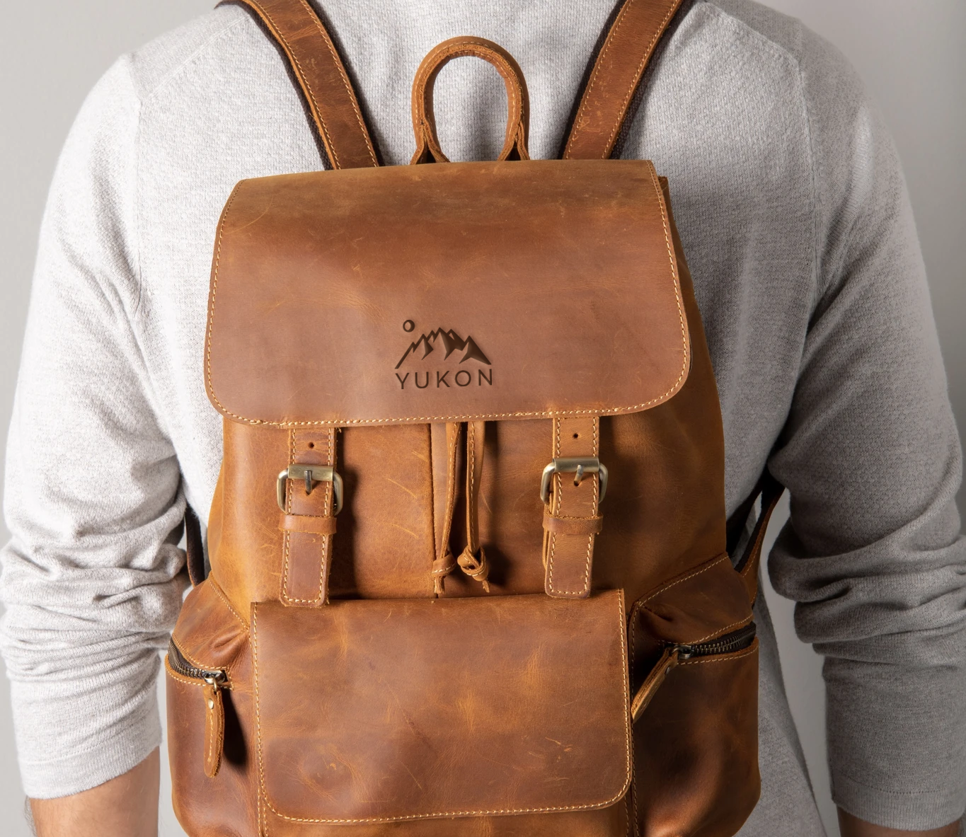

YUKON Bags is a genuine leather company that is dedicated to bringing high quality, hand made products to its consumers. They needed a logo design that was reminiscent of the great mountain range they represent that would still appeal to their demographic of young, entrepreneurial explorers! Adventure awaits so grab your Yukon bag and hit the trails!
Top CBD
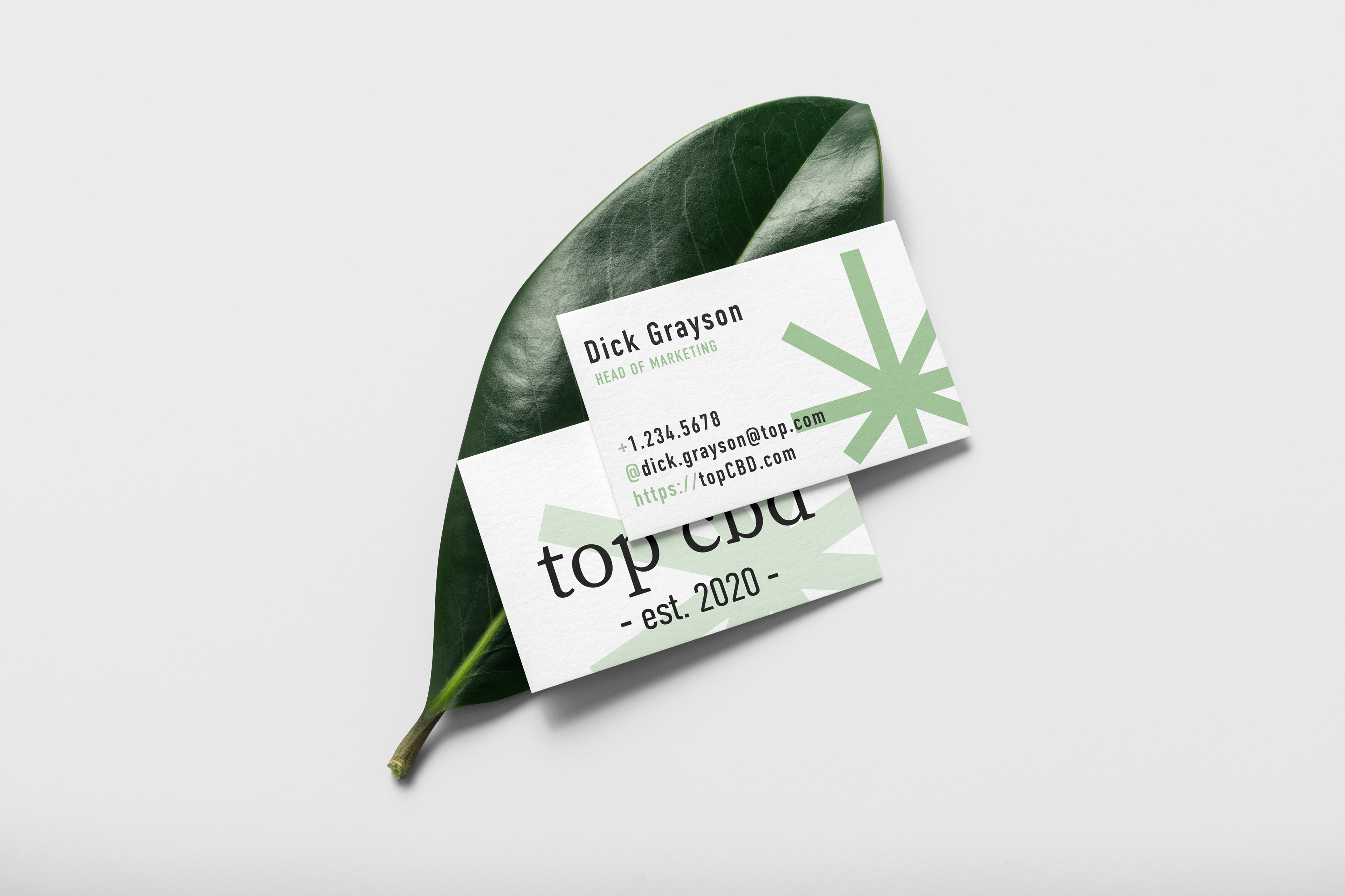
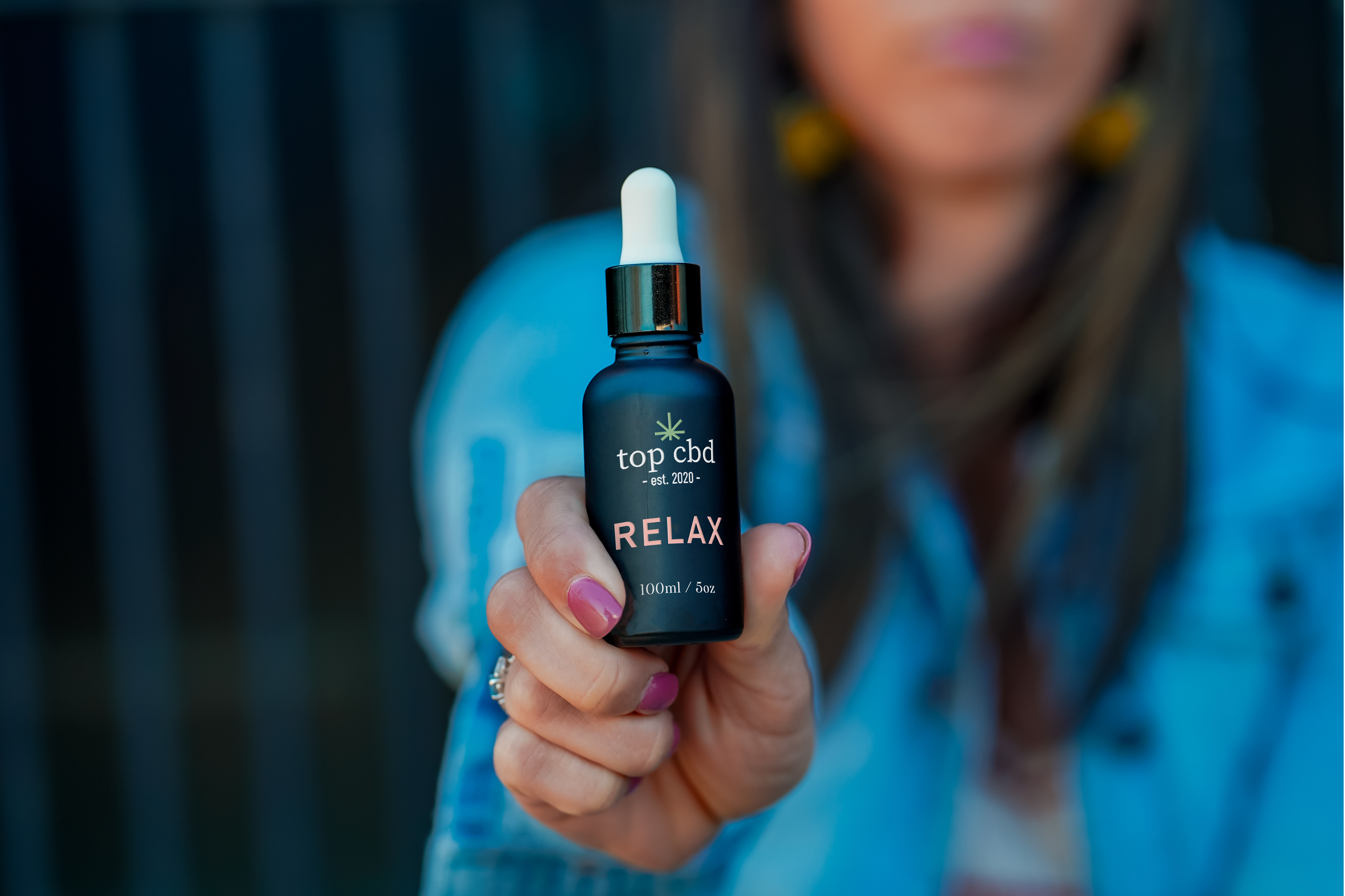
Top CBD is a Portland-based cannabis brand. They want to bring their consumers a high quality, compliant product to bring a calming touch into the lives of those who need it. This is the product is for driven women who want the effects of some after-work wine without the wait gain that comes with it. They needed a complete branding overhaul, including logo, colour pallet, marketing collateral, and compliant labeling & packaging. The minimalist style of the logo combined with the relaxed colour pallet is a subtle way to display the product without being too loud.
Streats
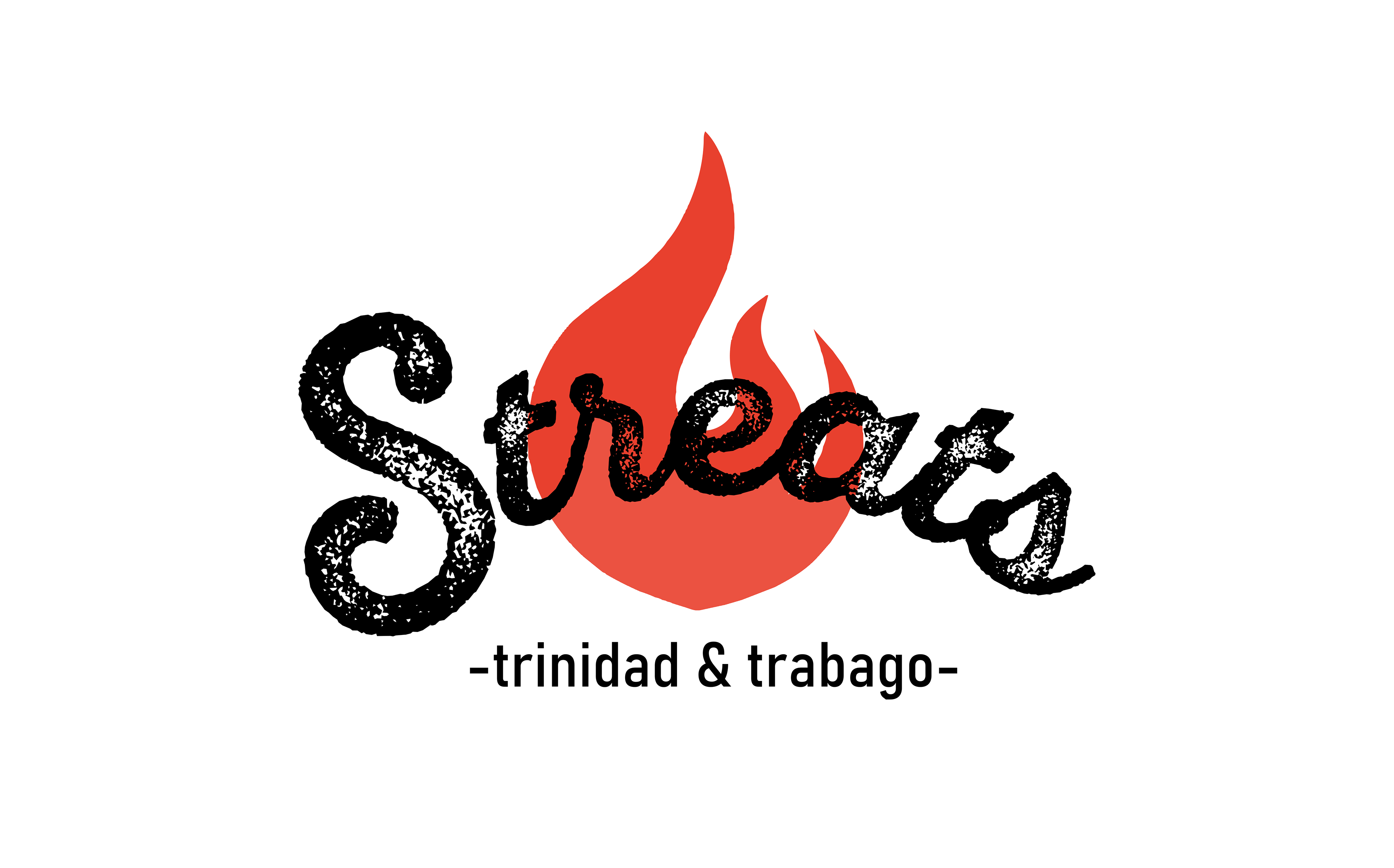
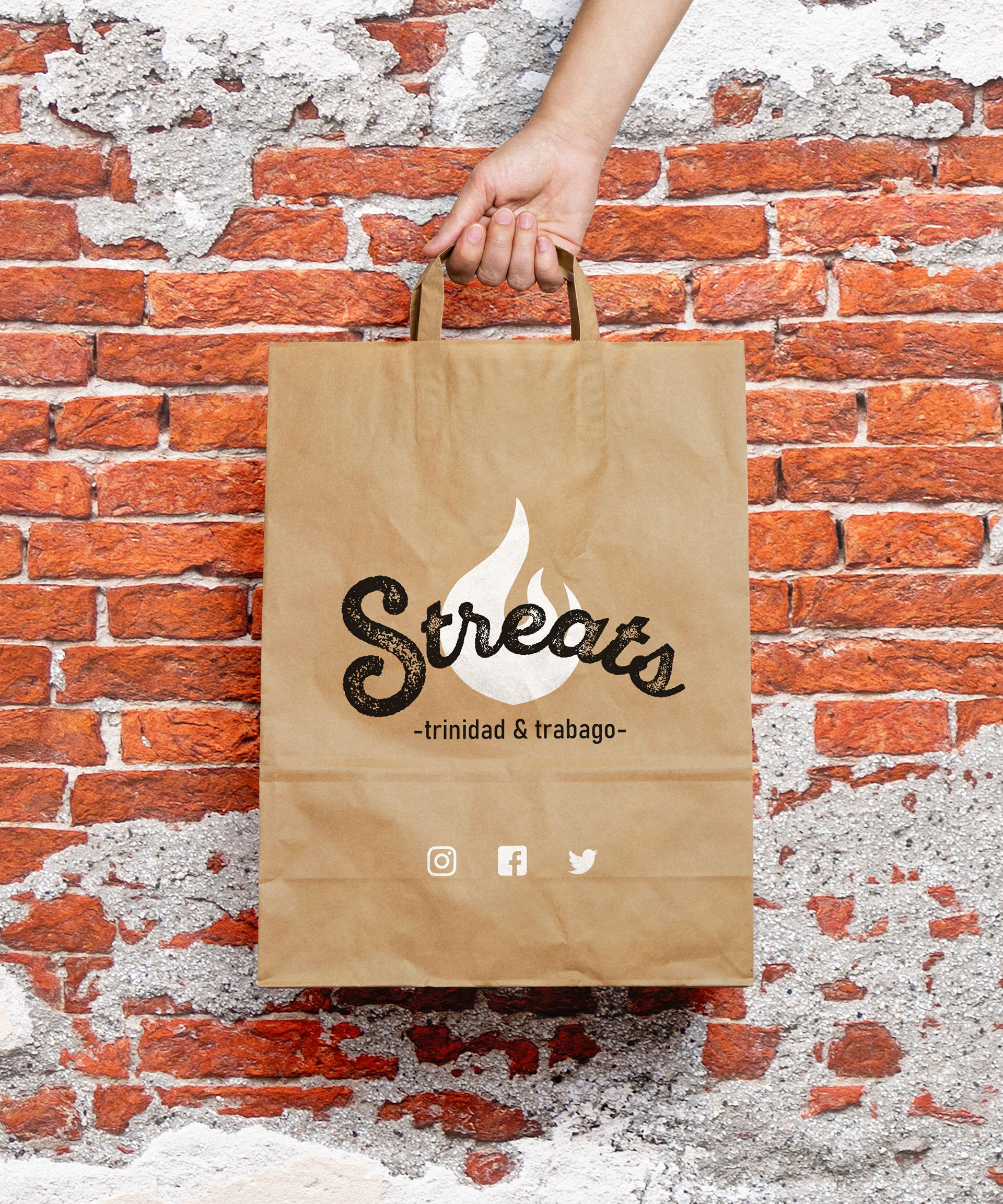
Streats is a food truck in Trinidad & Tribago that needed new branding for a huge carnival that was going on. Red, Black, and White are the national colours of Trinidad and Tribago. They needed punchy, yet minimalist branding to move through the cluttered street food market and attract a young, chic clientele.
Herptology
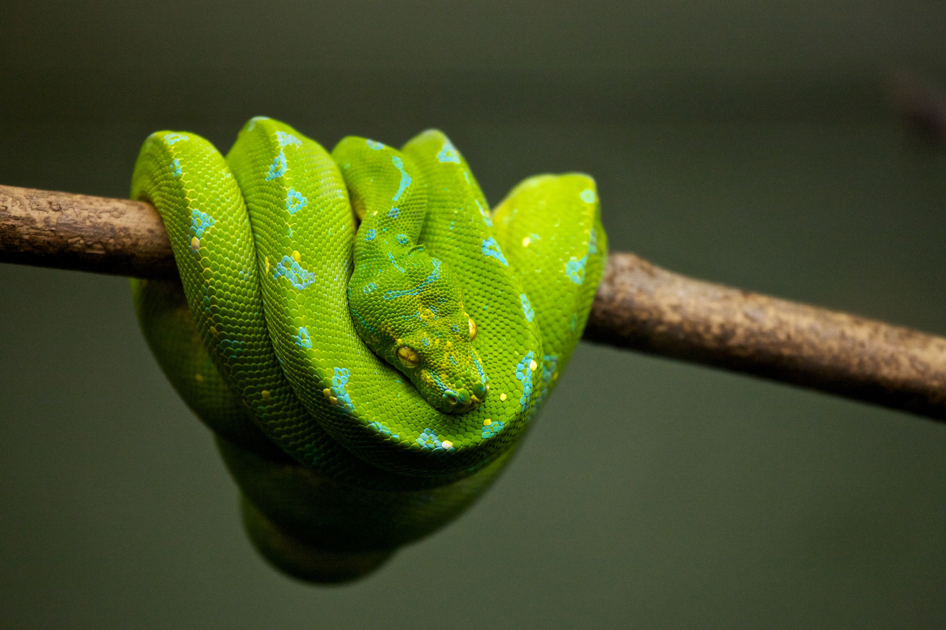
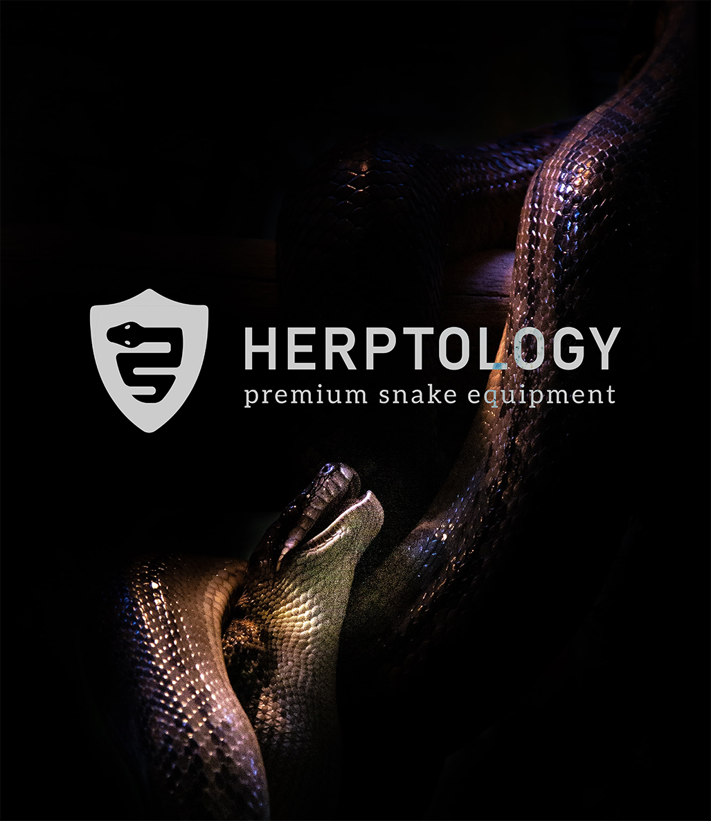
Herptology is a South African based snake equipment brand that's dedicated to bringing quality gear to its consumers. South Africa has some of the world's deadliest snakes, including the Black Mamba, which led the Herptology team to create a line of safer and more effective snake catching gear. The branding includes a shield and a snake, bringing an element of security to the brand while staying reminiscent of the Ranger backgrounds of the founders.
So Damn Good Coffee.
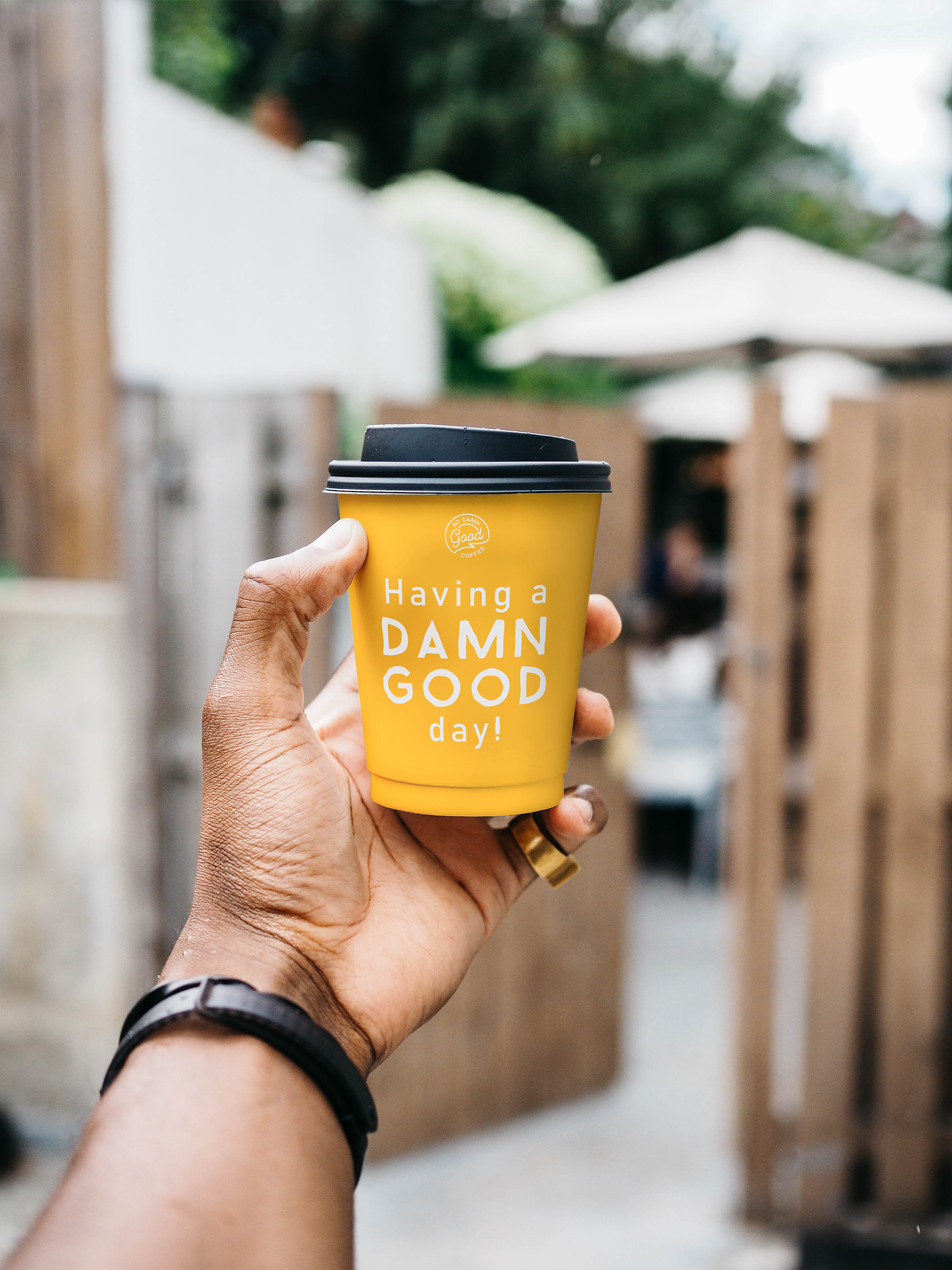
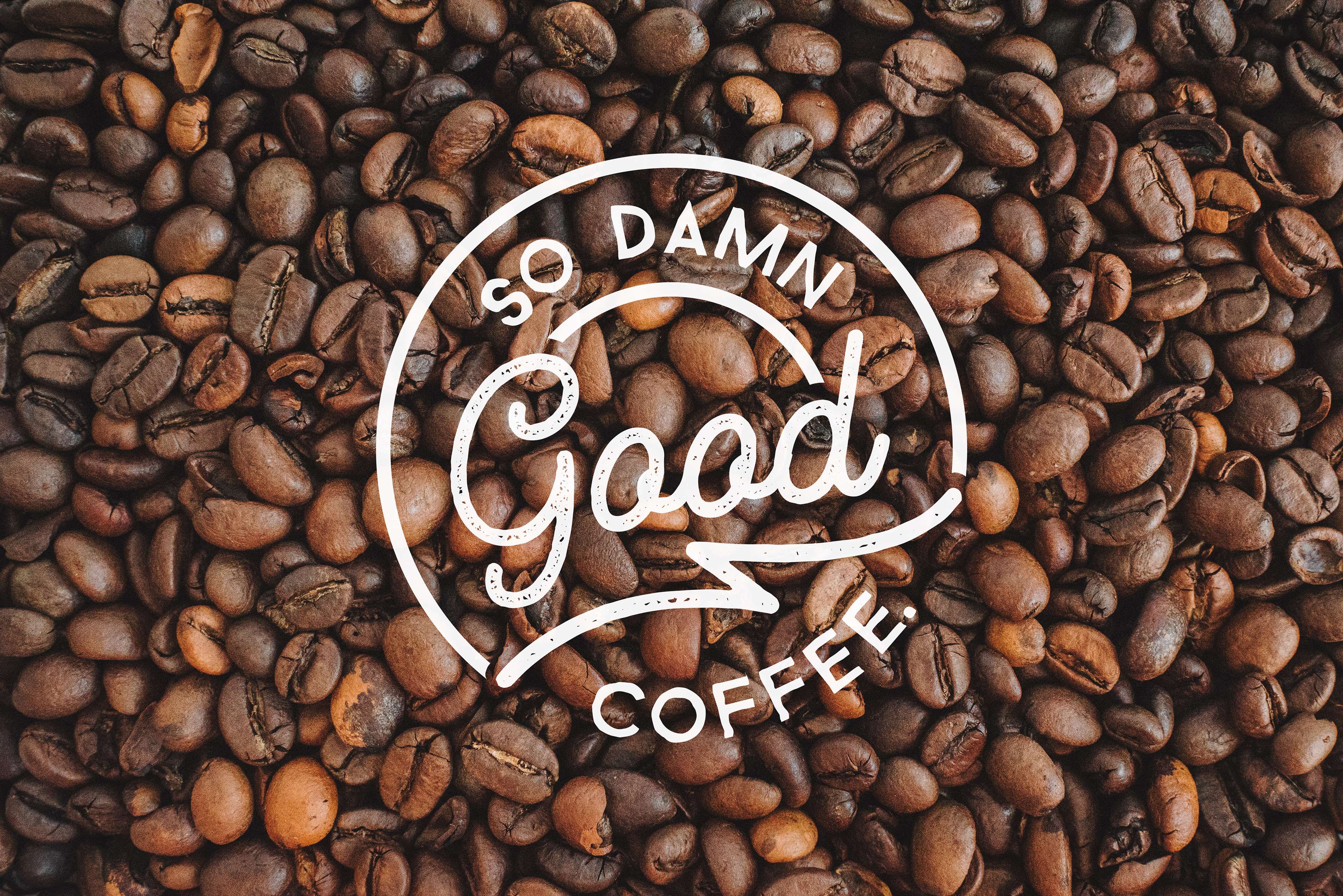
So Damn Good Coffee is a company that gives you a helpful morning boost in a more adult way. These single-sourced beans are a sun-dried to help give you that kick in the teeth you need to get going in the morning. The brand appeals to its target demographic of entrepreneurial, young professionals who work long hours and need some humour in their day. The strength of the coffee paired with the cheekiness of the messaging helps consumers create an emotional bond with the product that encourages them to integrate it into their daily routine. The brightness of the colour pallet adds another element of fun to the product.